User:Laecy
Grid: From the Ground Up
Grid is my favorite healing addon. It is highly customizable, very clean, and very informative. The downside is it can be difficult to set up. There are several resources out there, but some can be as confusing as the addon itself and few take you from downloading it for the first time to the potentially intricate customization process. So, I'm giving it a shot.
| Contents [hide] |
Getting Started
Dowloading Grid
You can download the addon from several sources:
Dowloading Pluggins
On all of those sites you can enter "Grid" into the search box and get long lists of additional pluggins. We'll get to them when we cover customization, but I'll list some here. Personally, I use:
Status Hots (though this one hasn't been updated in a while and is buggy)
Plus a few druid-specific ones.
First Look
When you first log in after installing Grid, you'll see a tiny square with a tab labeling it as Grid.

Accessing Configuration Options
There are several ways to access the configuration interface. You can:
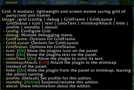
1) type /grid and get a long list of command-line instructions,
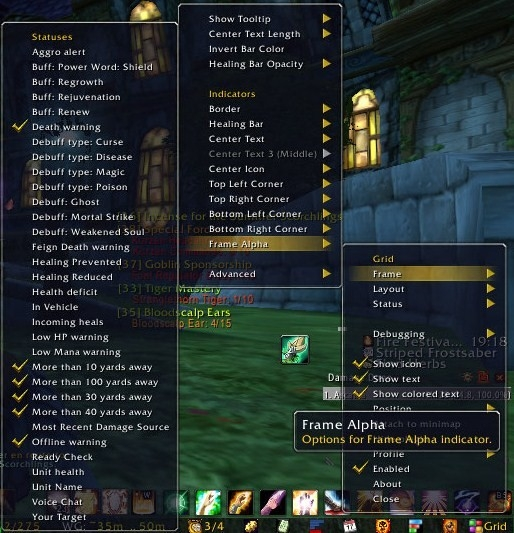
2) right click your minimap button/fubar widget and follow the waterfall menus, or
3) type /grid config and access a popup window.
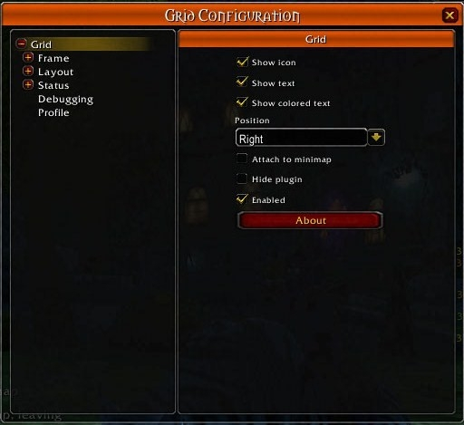
I prefer this third option and will use it in this guide.
Addon Options
The first menu you see, when "(+)Grid" is highlighted on the left-hand list, is the options for the addon itself. You can tweak your widget to fit in with your UI manager of choice.
Customizing The Grid
I think a lot of the confusion about setting up Grid comes from the simple problem that people want to go straight down the list of options. In fact, the most straightforward way to proceed is to start with Status, go to Layout, then build your Frames.
This is a pretty non-linear process. It helps a lot if you plan ahead. Choose which of your own spells you need to track, which debuffs you want to be warned of quickly, what information you want access to. This will be just a rough sketch at first, since you'll discover additional options as we go through the guide, but having a plan will help you keep everything straight in your head.
The basic frame for each character will look like this:

- Dark Blue - border
- Light Blue - main frame
- Black - lost health
- Red, Yellow, Green, and Purple - corner indicators
- You can also have a center icon indicator that will display over your lines of text.
So, you have a total of nine main places to display information. Pick the nine most important things for you to know about a person you're healing, and sketch out where you'd like each to show up. Don't forget that the character's name usually takes up one of the lines of text.
Using pluggins, you can add a whole slew of extra places to display stuff: a third line of text, side top and bottom indicators, etc. But for now, we'll just get the default frame set up.
Status
Click on "(+)Status" on the left-hand list to open the list of components.
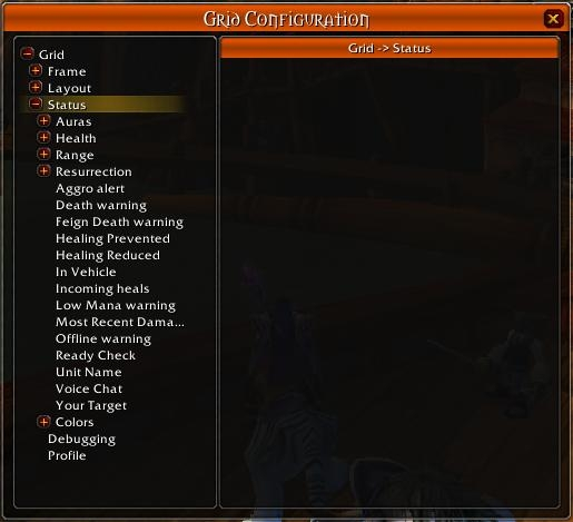
Auras
These are every buff and debuff that can exist on your character. Class buffs, Healing Over Time Spells, Shields, Poisons, Curses, etc. They can include Paladin Auras, but the term does not refer to them specifically.
Highlight "Auras" in the list. This will bring up a VERY IMPORTANT screen: the place where you can input new auras into your list.
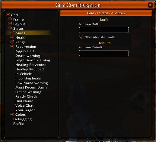
This is so important because it allows you to create fight-specific warnings for yourself. Ice Tomb, Gravity Bomb, all those boss abilities can be inserted into your list and flashed up on your frames so you can react quickly without having to look elsewhere for your information.
Click open the Auras list, and highlight one of the components, Buff: Power Word Shield, for example.
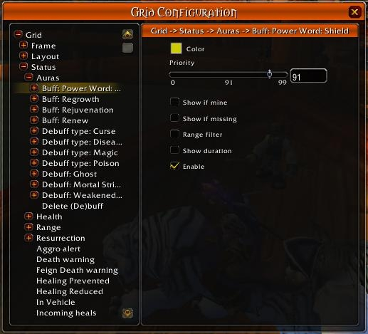
You can see several options for the buff.
- Color - choose the color that will represent this aura in your frame.
- Priority - if you want more than one aura to be shown on a single piece of your frame, this will allow you to choose which will be shown if two or more exist on the character simultaneously.
- Show if mine - recommended for HoT's. When I'm on raid heals, I need to know which characters I have Rejuv ticking on. If I don't ignore other druids' spells, I won't be able to tell who I need to heal.
- On the other hand, there is a pluggin for Grid that will create separate auras for your spells versus the same spell from another source. If you want to see both.
- Show If Missing - Helpful if there is a buff that needs to be on a character at all times, the appearance of an indicator will be more noticeable than one disappearing.
- Range Filter - I assume this means it won't track the aura on characters too far away for you to do anything to, but since I gray over my out of range frames, I don't really bother with this.
- Show Duration - will give you seconds remaining on the buff if it is displayed on an indicator capable of text.
- Enable - toggle whether Grid displays this aura at all. This is slightly redundant, since you have to assign each aura to a part of the frame for it to show up, but meh.
Click open the (+) beside one of the auras and you will see a list of classes.
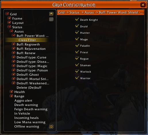
This will allow you to toggle the display of auras based on the character's class.
Frame
General
Highlight "(+)Frame" in the left-hand list. This provides you with a few general options.
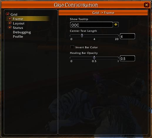
The first determines when tooltips will appear to give you additional information as you mouseover your Grid frames: Always, Never, and Out of Combat. I keep mine on OOC, since none of the tooltip info is pertinent actual fights.
The second option lets you choose how many characters the line of text displays. You'll likely want to adjust this based on what information you choose to show on that line, how long your guildie's names tend to be, and the size you eventually make your frames. The default is the first four characters of your toon's name. This doesn't seem to be the most logical place for this option; make note of it so you can come back when you have the other details ironed out.
The third switches the background/forground colors of the frames.
 <===>
<===> 
For the most part, this determines whether your gray bar turns color on taking damage or your colored bar turns gray on taking damage. Personal Preference. I will turn this on for this guide.
As for the fourth option, someone else will have to edit this bit, since I have yet to figure out how to use it.
Frame Components
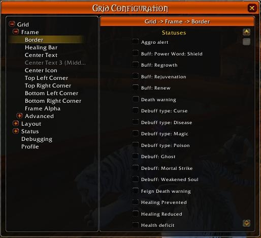
Go ahead and click open "(-)Frame" on the left-hand list, and highlight the first option in the sublist "Border". You'll see a long list of checkboxes on the right-hand side of buffs, debuffs, etc.
